We're going to try to paint baby's room soon. We'd like to do it before his furniture arrives and it's set to come in November. My folks are going to be here next weekend so we might take the plunge and just do it then. The funny thing is that it's currently our guest room, which has a black toile comforter with pink sheets. We're going to paint the walls some sort of green and/or blue, and then temporarily stick our guest room stuff back in there. I don't think I'll be able to go in there without twitching ;)
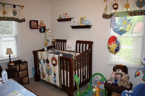
This is the bedding set we chose. We would like to eventually buy most all the pieces-the wall art, the rug, the valance, the border, etc.


So we're trying to decide what to do about paint. BRU has online reviews where people can post pictures of the products in their home so we've taken some ideas from them.
Here's one person-for some reason, I can't make their picture blow up. But you kind of get the idea.

Here are some other things people have done:


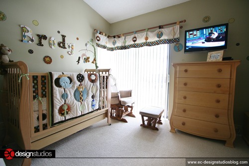
DH wants to know if we can have the flat-screen-in-the-nursery version :P
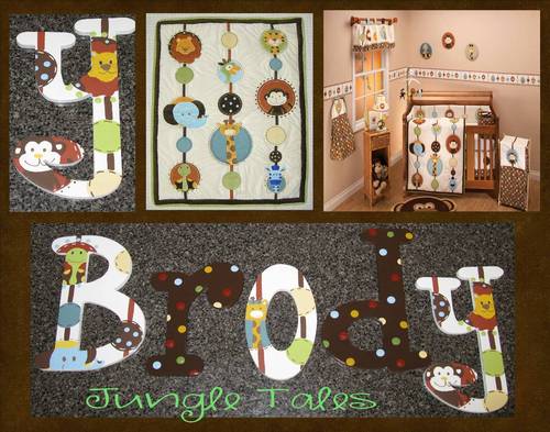
And I TOTALLY want to do this with his name! Isn't it cute?
Other people did options with the brown, tan, and even in one case, the brick color, but we didn't care for those. The chocolate was too dark, the tan was too drab, and the brick just isn't "us."
So I think we've decided on some sort of blue/green combo. I do like the one with the green on top and cream on the bottom, too. We'll also be putting the border up somewhere.
But we can't decide on the actual execution. DH likes the pastel colors, and I like the bright ones. I think we both like the half/half split horizontally around the room thing, but blue on top? Green on top? Which blue and green? I also like the pea soup green that's in the one picture that just shows a wall hanging, and the faint faint hint of green that's in the flat-screen picture.
I ordered samples of these two colors, thinking an earth-tone version of the colors would be a good compromise:


But I'm really NOT an interior decorator or skilled in this, so please throw any suggestions you have at me!
This is our furniture choice (in this color)
So anyway--ideas! Let me have 'em!
I like blue on top with green on bottom. Makes me think of grass and sky. I also like the all green version. But then I really like green!
ReplyDeleteI love the pattern you chose!
Diane
snowflakesintherain.blogspot.com
I think if you go with a light blue, having the blue on the bottom (near the furniture) would really look nice with your dark furniture.
ReplyDeleteI LOVE the one with the dots and with the stripes on the bottom.
ReplyDeleteWOW, Brody has a nice flat screen t.v.!
http://funnylittlepollywogs.com
I like blue on top and green on bottom (like the fourth picture down). Really meshes well with the border.
ReplyDeleteI'm no interior decorator either, but I do like the bedding you have chosen. And there are a lot of fun colors to work with - no matter what you guys decide! :)
ReplyDeleteLove it! Can't wait to see what you come up with. I bet it's going to be wonderful.
ReplyDeleteI think it all sounds lovely! I am so very, very impressed! Can't wait to see what you do with baby's room. :)
ReplyDeleteI'd just make sure that whatever colors you choose the color on the bottom is darker than the color on the top.
ReplyDeleteI have the same opinion as Diane's post! And I tend to like color!
ReplyDeleteI like the Aqua and yellow one. I love those two colors together.
ReplyDeleteI think the blue/green combo is so cute with the border running down the middle. Word of advice when picking colors... make sure you have an actual piece of the pattern with you so that you aren't eyeballing it and end up with clashing colors. It's also a good idea to get a small amount of the paint color and either put a patch of it on the wall in the room or paint it on a poster board so you can see how the color works in the lighting of the room. What works in one room might look a little off in another room. Some manufacturers make sample bottles for just this purpose. It's pretty handy.
ReplyDeleteOk I'm a little late in responding but I vote for the earthy sage green and brown! I absolutely LOVE the polka dots pic:) And if you decide on blue make sure its more of a dusty/earthy blue- blues are SO HARD to get right. Good luck!
ReplyDelete